
El objetivo ha sido una actualización de la marca, manteniendo los valores principales y ofreciendo una imagen innovadora, creativa, dinámica y de expansión.
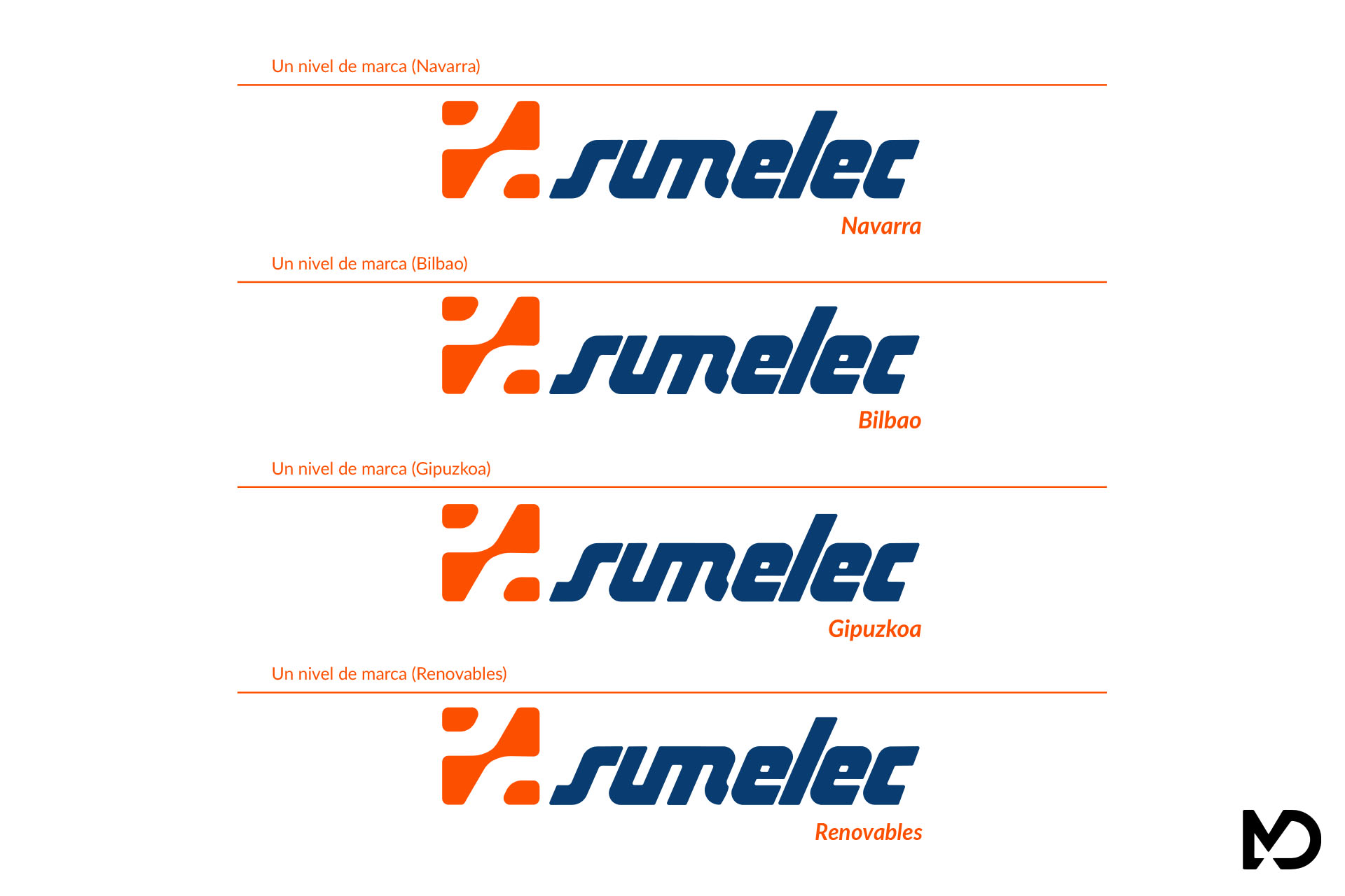
Isotipo: Es un cuadrado cortado en sus cuatro lados por dos trazos. Una de ellas es la parte superior de la S de Sumelec y la otra la parte inferior.
Logotipo: Sumelec es la palabra que lo forma y esta alineado a la parte inferior del isotipo. Respetando la tipografía del primer isologotipo, se le ha hecho una modificación en los vértices, poniéndolos todos redondeados para que tuviera una coherencia con el isotipo.
Navega por la galería para ver algunas imágenes del proyecto.
Cliente: Grupo Sumelec
Sector: Suministro de material eléctrico.
Servicios: Branding.
Web: Grupo Sumelec
Cookie | Duración | Descripción |
---|---|---|
cookielawinfo-checbox-analytics | 11 months | This cookie is set by GDPR Cookie Consent plugin. The cookie is used to store the user consent for the cookies in the category "Analytics". |
cookielawinfo-checbox-functional | 11 months | The cookie is set by GDPR cookie consent to record the user consent for the cookies in the category "Functional". |
cookielawinfo-checbox-others | 11 months | This cookie is set by GDPR Cookie Consent plugin. The cookie is used to store the user consent for the cookies in the category "Other. |
cookielawinfo-checkbox-necessary | 11 months | This cookie is set by GDPR Cookie Consent plugin. The cookies is used to store the user consent for the cookies in the category "Necessary". |
cookielawinfo-checkbox-performance | 11 months | This cookie is set by GDPR Cookie Consent plugin. The cookie is used to store the user consent for the cookies in the category "Performance". |
viewed_cookie_policy | 11 months | The cookie is set by the GDPR Cookie Consent plugin and is used to store whether or not user has consented to the use of cookies. It does not store any personal data. |
¿Necesitas ayuda?